All of our website theme designs are responsive, meaning that the same site will display when viewed on any device, and the page areas will rearrange or shrink to fit the width of your screen. Some areas can be manually adjusted if they do not stack the way you want them on mobile or tablet devices.
Adjusting Values by Breakpoint
When editing some types of content areas in your GZCMS Page Editor, you will see a device icon next to a setting or field. This icon indicates that the values of these areas can be set differently based on three main breakpoints:
- Desktop
- Tablet
- Mobile
These settings can be useful for adjusting things like alignment, font size, margins/padding for different areas so they appear as desired on various devices, but it can also be used within the column settings to adjust how the page stacks, and how much of the available width each column should take up based on the selected breakpoint. Watch a video about how to adjust column settings here.
Switching Column Stacking Order on Mobile
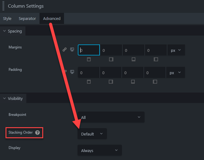
You can reverse the order in which columns stack on mobile devices within the Advanced tab of the column settings (to access column settings: hover over a content module within the desired column, click the "edit column icon" and select Column Settings from the dropdown).
For example, these columns are set to "Reversed" stacking. When viewed on a desktop, the image will display first (to the left), but when you shrink your browser window or open this page on a mobile device, the text will display first and the image will stack second, just like the default order of the other columns on this page where the image is to the right on desktop. This makes a consistent mobile display while allowing for diversity on the desktop view.
Hiding Items From a Device
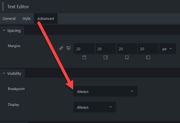
Under the Advanced tab for any module within the Page Editor, within the Visibility section there is a "Breakpoint" dropdown that allows you to set if the item you are editing should only display on certain device sizes:
- Always
- Large Devices Only
- Large and Medium Devices Only
- Medium Devices Only
- Medium and Small Devices Only
- Small Devices Only


